


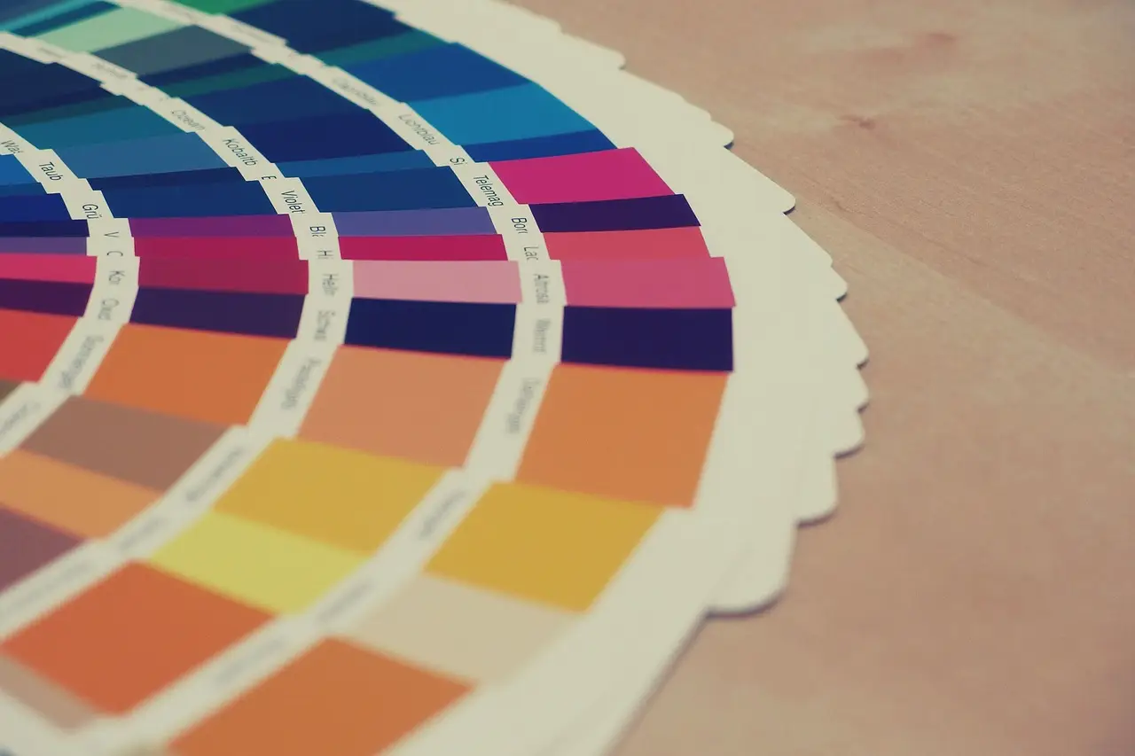
Picking your brand’s colours is a big decision. It’s usually the first thing customers notice, even before they read your tagline or look at your products. Research shows that up to 90% of snap judgments about products are based solely on colour.
With so many colours to choose from, it’s easy to feel overwhelmed. Many people feel both confused and excited when they start looking. The key is to balance what’s trendy with colours that connect to people on a deeper level.
Why Colour Choice Matters in Branding
Aesthetic colours aren’t just for looks. They show off your brand’s personality. When it comes to promo products, the right colour can turn a shirt into someone’s favourite or leave it forgotten in a drawer.
Studies in the psychology of colour reveal how specific hues drive consumer behaviour:
- Blue: Evokes feelings of trust, dependability and strength. Several top brands worldwide use this colour.
- Red: Creates a sense of urgency and excitement, often physically increasing heart rates.
- Green: Synonymous with health, tranquillity and nature.
- Yellow: Represents optimism and clarity, grabbing attention quickly in a crowded marketplace.
Once you know what each colour means, you can pick a palette that matches your business values. Try naming which value each colour represents. This way, your colours look good and truly reflect your brand.
Step-by-Step: How to Find Aesthetic Colours That Work For Your Brand
Finding a palette that feels both “aesthetic” and professional requires a structured approach. By following these steps, you will hold a palette ready for print and pixel.
1. Define Your Brand Personality
Start by writing a short story about how your brand began. This helps keep your choices true to your brand. Then, pick three words that describe your brand (like bold, energetic or calm). For example, a gym might use neon orange and charcoal, while a spa might choose soft greens and creams.
2. Look Beyond the Primary Colours
In 2026, more brands are moving away from basic primary colours. To find colours that really stand out, try exploring:
- Muted Tones: These colours are mixed with grey or white to look more sophisticated. When compared to brighter versions, muted tones often feel more elegant and subtle.
- Monochromatic Schemes: Use different shades and tints of one colour for a clean, unified look.
- Earth Tones: Colours like terracotta, sage and sand are very popular in Australia right now, especially for brands that focus on sustainability.
3. Use Tools to Experiment
You don’t have to be a designer to find great colour combinations. Tools like Adobe Color or Coolors let you search thousands of palettes with keywords like “minimalist” or “vintage.” Once you find one you like, you can save and share it with your team.
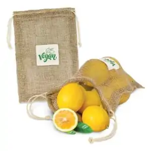
The Role of Colour in Promotional Merchandise
fter you pick your colours, the next step is making sure they look good on real products. Sometimes, a colour that looks great on a screen can look dull when printed on fabric. Some businesses have seen up to a 30% return rate when colours don’t turn out as expected.
Matching Your Palette to Materials
At Promo PAL, we analyse how your aesthetic colours interact with different textures to ensure your branding remains vibrant.
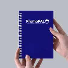
- Soft Goods: Embroidery on caps or printing on hoodies can change how a colour feels. For instance, choosing a rich burgundy thread for headwear often feels more “premium” and retail-ready than a standard red, which can increase your brand’s perceived value in your customers’ eyes.
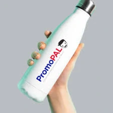
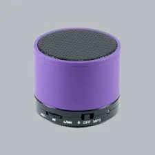
- Hard Goods: Powder-coated water bottles or matte tech gadgets look very different from shiny plastic items.
- Pantone Matching: We suggest using the Pantone Matching System (PMS) to maintain colour consistency. This way, your brand’s blue will look the same on a pen and a polo shirt.
Trending Aesthetic Palettes for 2026
If you need ideas, here are three popular colour trends in Australian corporate branding right now:
- The “Eco-Minimalist”: Sage green, warm beige and slate grey. Perfect for sustainability-focused brands. (Tip: Add a touch of deep coral to energise the look).
- The “Cyber-Professional”: Deep navy, electric cobalt and stark white. This high-contrast look feels modern and tech-forward. (Tip: A pop of neon yellow offers a unique, innovative twist).
- The “Modern Heritage”: Burnt orange, forest green and cream. These retro colours are making a massive comeback. (Tip: A subtle lavender accent can enhance the sophistication).
Make Promotional Products with Your Brand Colours
Choosing your colours is just the first step. The real impact comes when people see your colours everywhere and start to remember your brand. With over 30 years of experience, our team knows which products will help your colours stand out.
At Promo PAL, we help you see how your branding will look on real products. We give quotes in under 2 hours and send digital artwork proofs, so you can check your colours before anything is made. No matter where you are, we make sure your brand always looks its best.
Our 4-Step Streamlined Process
We serve all of Australia, from bustling CBDs to the most remote outback communities.
- Form Submission: Tell us your vision
- Rapid Quote: Get pricing in under 2 hours.
- Artwork Proof: View a digital mockup before we print.
- Manufacturing: We handle the logistics, with delivery taking 3 days to 12 weeks depending on the order.
Ready to put your brand in their hands?
Don’t let your marketing message get lost in a digital feed. Let’s create something your customers will hold onto for years.
Browse our full range of promotional products and receive a quote in under 2 hours.